Bright Interactive
Realise your brand potential
Bright was originally founded as a software development agency in 1999, but more recently has found success and traction by transitioning into a SaaS led, customer centric product company best known for delivering high-quality digital asset management software, exceptional customer support and expert training services.
- Angular 9+
- TypeScript
- NgRx
- Sass (scss)
- Storybook
- Karma & Jasmine
Overview
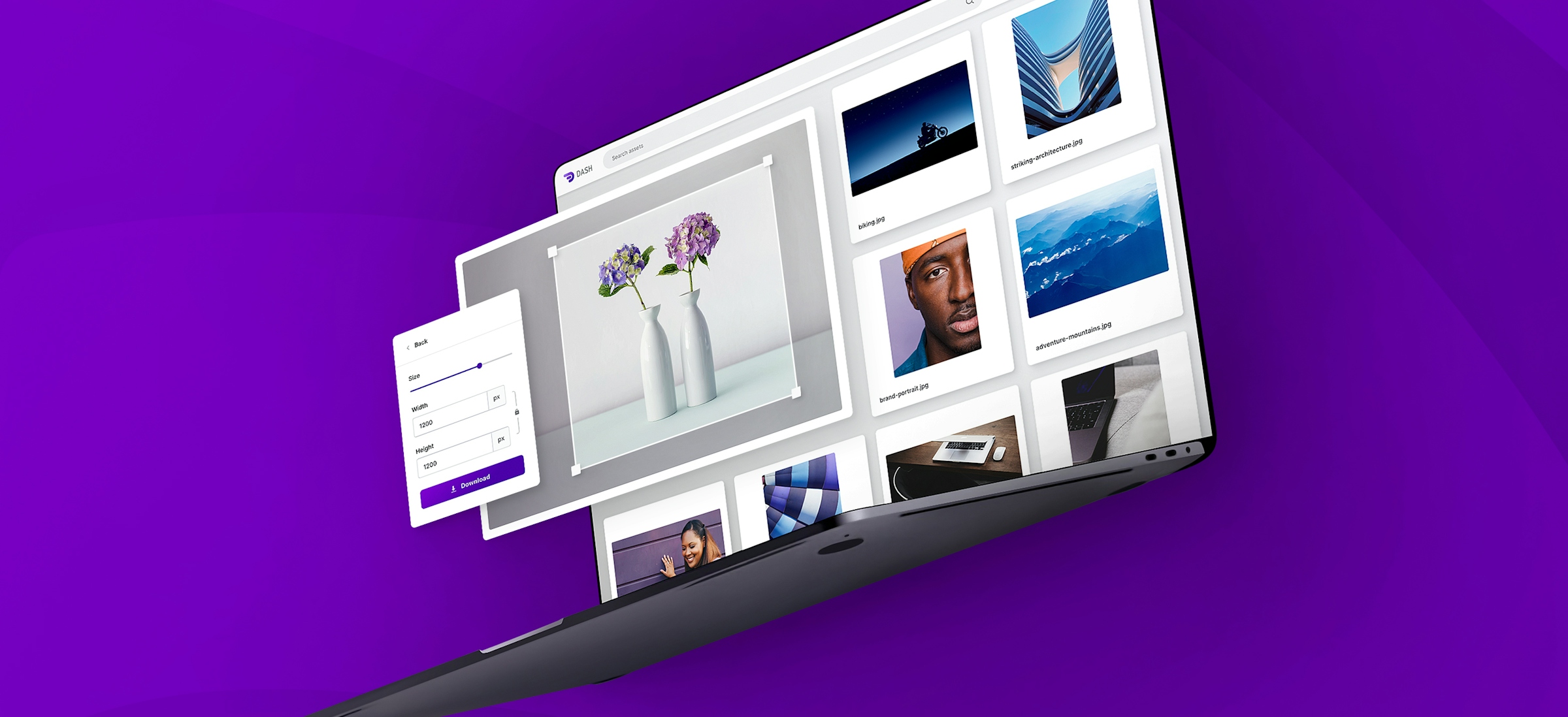
In 2018 I joined the Bright team to evolve and elevate the user interface of Dash, a new streamlined digital asset management product that the team were busy preparing to ship as an MVP.
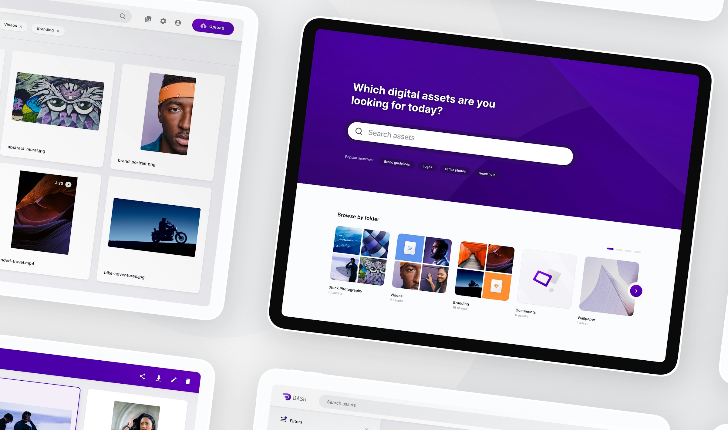
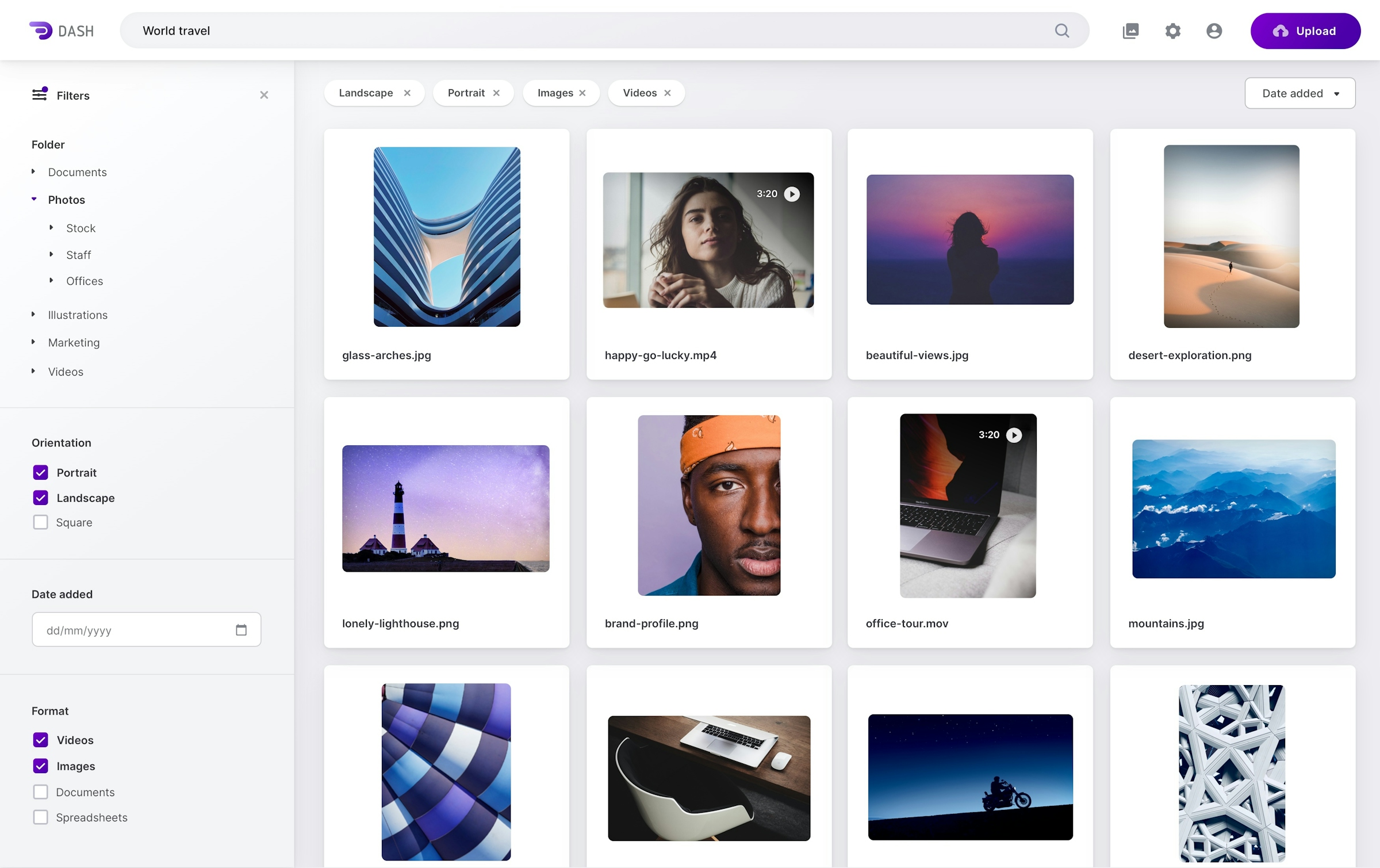
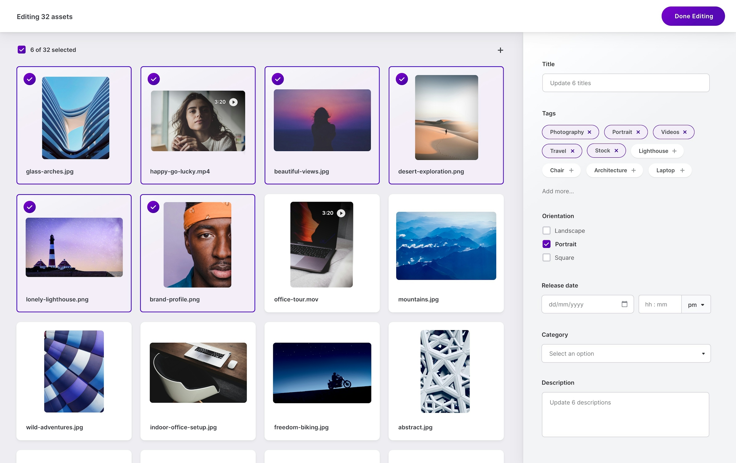
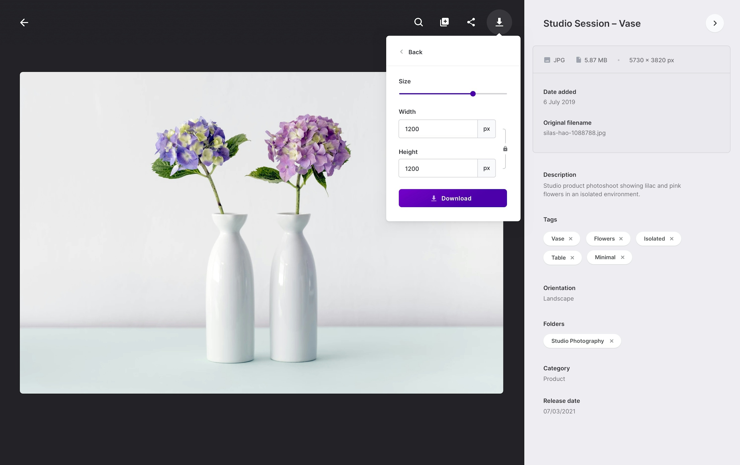
Digital assets are not to be confused with digital currencies in this context. Digital assets can be anything from images and videos to documents and spreadsheets, anything an organisation would need to align around and provide easy access to, whether for marketing, operations or commerce. The unique selling point with Dash is the ability to easily find and share exactly what you need. A large library of assets can be effortlessly categorised and organised through the use of facial recognition, in scene object tagging and metadata extraction.
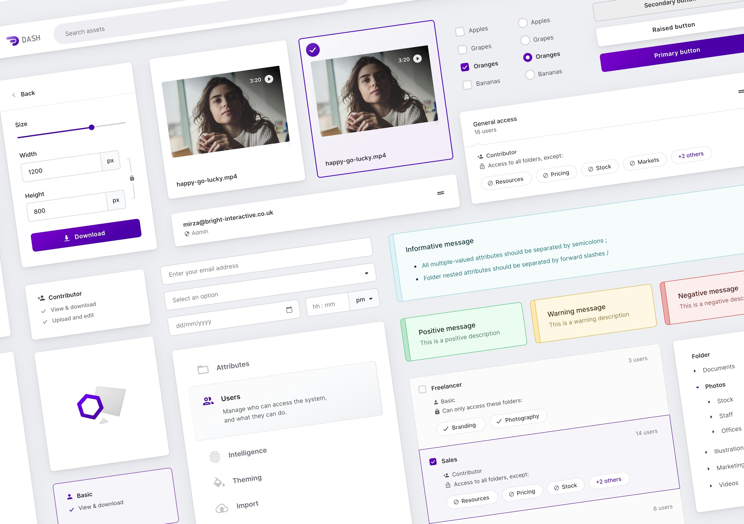
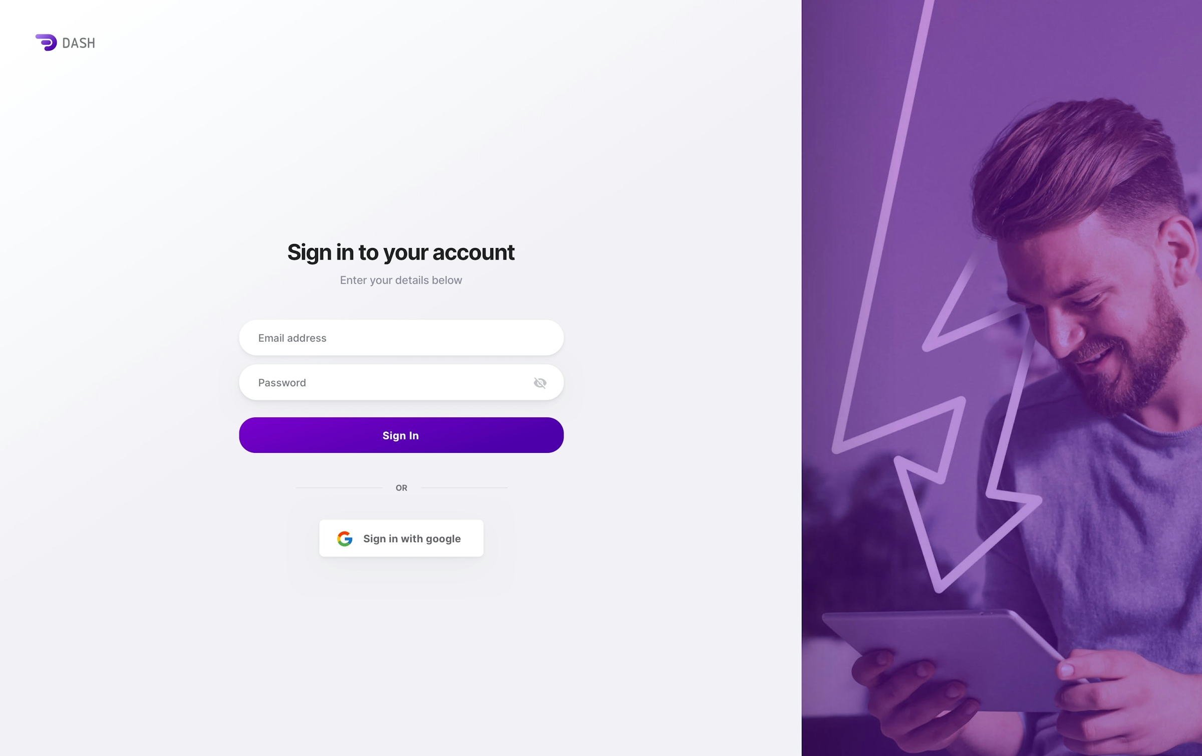
For Dash, the team were very clear that they really wanted to have a delightful, high-quality user experience and felt their visual design at the time, didn't quite deliver on that promise. I ultimately contributed to heavily redesigning the visual aesthetic and helped ship a consistent, portable UI kit, styling system and various high impact features on the front-end.
Crafting a portable component system
The first area that I looked at was how the team were approaching visual style within the application, Dash is an Angular SPA supported by a micro-service backend architecture and made heavy use of Google Material design principles and their associated UI primitives. While Material principles are solid and offer great documentation for aligning a team, the visual style itself lacks unique character and often illicits a heavy association with Google products.
Having taken the time to understand the problem space, get familiar with the codebase and liase with the brand team, I drew up a set of guiding principles and aspirational designs that would influence the visual style and align it with a yet to be revealed company wide rebrand.
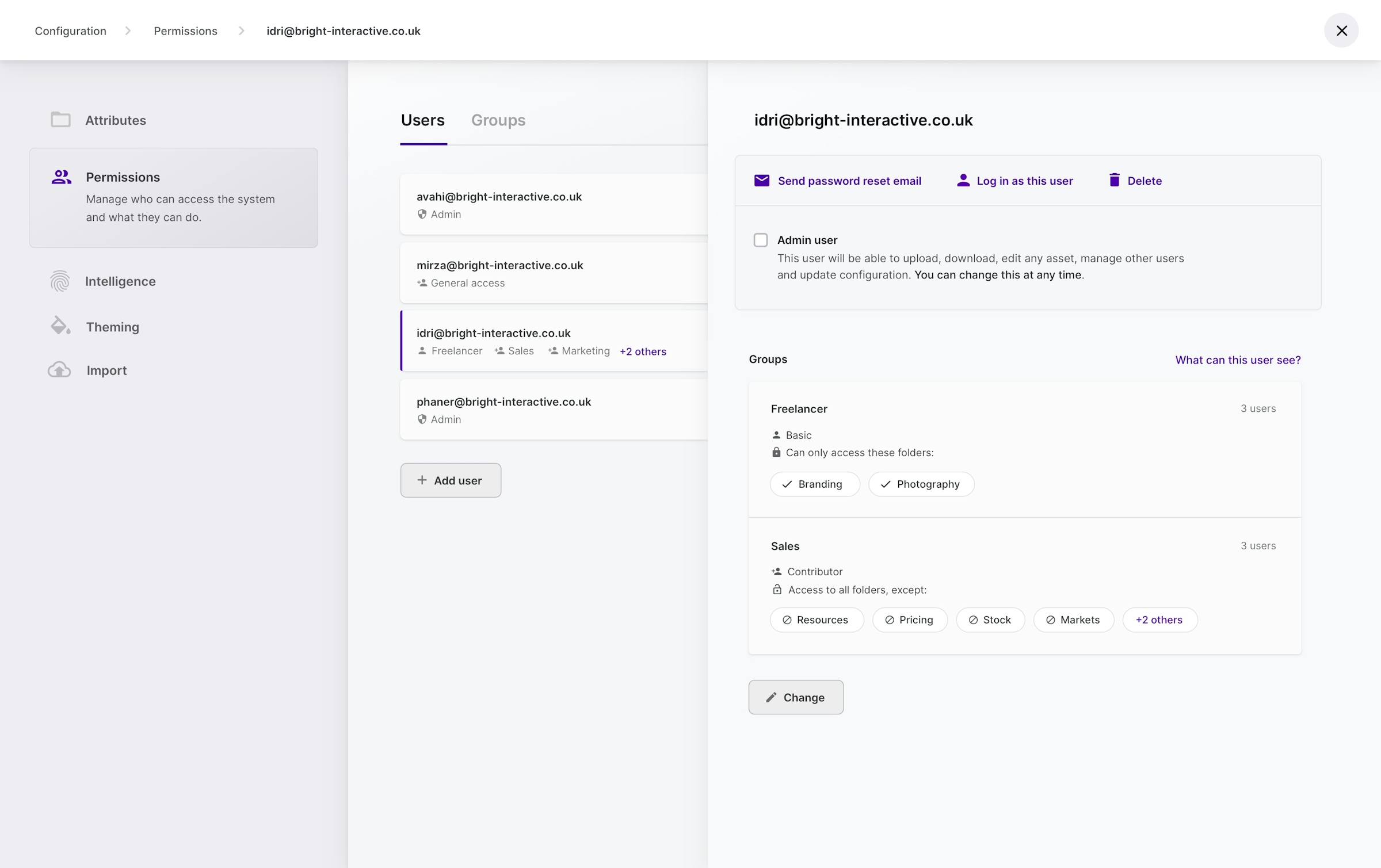
The codebase at that time did feature an initial design token implementation but the application of it was spotty and inconsistent. I worked with the team to build out a revised set of tokens by extending and improving the existing Sass (scss) utilities, from spacing and typographic scales to colour palettes and a custom theming system, this would go on to be exposed to end-users via a white labelling feature in the dashboard.
Modern digital asset management
Over time we continued to build out the component system while also shipping features and iterating based on customer feedback. We would later encounter technical limitations such as poor performance within our list view with large collections. I worked with the team to successfully implement a virtual viewport which enabled us to clamp the number of rendered nodes and improve performance.
As a small team with a lean start-up mentality, we had to tackle each and every problem with ruthless prioritisation and make the right choices of when to favour features over improving our developer experience or pay down technical debt. This is the reality of quickly shipping value to users and is even more crucial as we were in the validation stage and needed to quickly test product decisions to find fit. I feel proud to have been able to provide high impact UI engineering and deliver on one of the teams core pillars in delivering a slick, delightful user experience.
Andy is inspiring, supportive, curious, always looking to expand his skills, and generally a great person to be around with. Working in a team he understands the importance of clear goals and how to best achieve the team’s aims. His attention to detail makes everything he touches look incredibly polished, and affirms his elegant simplicity.
